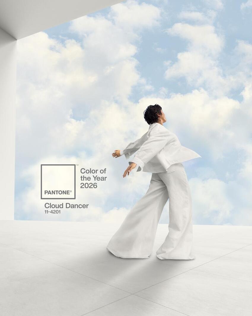
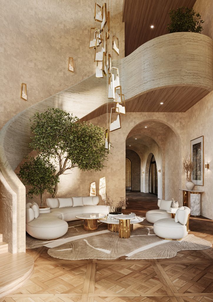
Cloud Dancer: Inside Pantone’s Calmest Color of the Year – Pantone has unveiled its 2026 Color of the Year: Cloud Dancer (PANTONE 11-4201), a light, atmospheric white that makes history as the first white shade ever selected since the Color of the Year initiative began. Far from feeling stark or clinical, Cloud Dancer is positioned as a nuanced neutral — a “billowy, balanced white imbued with a feeling of serenity.” Neither distinctly warm nor cool, it exists in a subtle middle ground, offering an adaptable softness that feels organic, refined, and quietly luxurious. According to Pantone’s creative leads, this “lofty white neutral” transcends the idea of color alone, becoming a broader design statement. It channels calm, clarity, and renewal, presenting a symbolic “clean slate” for a time defined by the collective desire for simplicity and emotional ease.
See Also: Christmas Decor: Curated Ideas for Festive Luxury and Warmth

Cloud Dancer
Inside Pantone’s Calmest Color of the Year
Cloud Dancer’s influence is poised to spread rapidly through fashion, lifestyle, and interior design magazines, evolving from a trend to a visual language. Expect pages drenched in light, where white space takes center stage, and layouts breathe with intention. This soft white will appear everywhere, not as a backdrop, but as a mood. It will shape photography, typography, and styling choices, encouraging restraint, clarity, and quiet luxury.

The choice of Cloud Dancer for 2026 signals a notable shift in both designer and consumer priorities: a move away from visual clutter and overstimulation toward a craving for calm, openness, and mental clarity. Pantone suggests that people are increasingly drawn to simplicity, stillness, and meaningful connection, a response to the hectic, over-saturated pace of modern life.
Cloud Dancer embodies a “fresh start,” offering a reset for interiors, emotions, and creative spaces alike. For design professionals, it represents an opportunity to rethink interior aesthetics, steering away from bold, intense colors and embracing a soft, minimalist approach that prioritizes light, space, and atmosphere over showy, eye-catching tones.

Cloud Dancer’s rise speaks to a wider cultural shift, one defined by growing exhaustion with constant stimulation and a shared desire for calm, clarity, and breathing room. Using this shade goes beyond trend-driven design; it reflects an attitude rooted in simplification, mindful choices, and intentional living. More than a color, Cloud Dancer supports the reclaiming of space in all its forms, physical, mental, and emotional, aligning design with a quieter, more considered way of being.

See Also: Kitchen Design: Decorative Hardware that Elevates Every Detail
Feel free to leave your thoughts on this week’s article about “Cloud Dancer: Inside Pantone’s Calmest Color of the Year.” Browse through LUXXU and PullCast to discover a wide range of interior design solutions, sponsored by the creativity of the Interior Design Magazines Blog team. For more inspiration, follow us on Pinterest, Facebook, and Instagram.